Microsoft recently changed its default font from Calibri (which had been the default for years) to Aptos – so on Thursday, March 7th we took a closer look at computer fonts in general. By the way, Aptos was originally named Bierstadt, it’s a sans-serif typeface in the “neo-grotesque” style developed by Steve Matteson and was released in 2023. Here’s a quote from the NYTimes about the new font:
“In most sans serif fonts, “the capital ‘I’ is a line, and the lowercase ‘l’ is a line,” Mr. Friedman said. “The weight is slightly different, but most people can’t see it. In Aptos, the lowercase ‘l’ has a tiny curve at the bottom. Illinois. Illustration. It’s very clear what you’re reading, even in a sans serif.”
“It’s both quirky and creates a more natural feel that brings in some of the serif font ‘je ne sais quoi’ to it,” he added.
In another subtlety, above the lowercase i’s and j’s are circular dots as opposed to squares as in Calibri. You may notice this when you type “je ne sais quoi” in Aptos.”
Digital fonts are complicated things. So Chris asked Chat GPT to explain what a Font is, the difference between web and print fonts and why some fonts appear different on different devices… Here’s a heavily edited version of what ChatGPT said (it tends to be very wordy! )
What is a Computer font ?
A digital representation of a typeface used to display text on electronic devices (computers, smartphones, and tablets). Fonts define the style, size, and appearance of characters, allowing users to customize the text.
A system font is one pre-installed in an operating system (e.g., Windows, macOS, Linux). These fonts are available to programmes such as wordprocessors, and are designed for consistency and readability across the system’s interface and software.
Print fonts are designed for printed materials such as books, magazines, and newspapers. They are typically high-resolution and optimized for clarity and readability on a printed page. Examples include Times New Roman, Arial, and Garamond.
Web fonts are designed specifically for displaying web content on screens of different resolutions and sizes. Web fonts are typically hosted on remote servers and loaded dynamically by web browsers, allowing website designers to incorporate a wider range of typefaces into their web designs. Popular web font services include Google Fonts, Adobe Fonts (formerly Typekit), and Font Squirrel.
Why do fonts look different of different devices, or even in different in different browsers?
Several (complicated !) factors are involved —
Rendering Engine: Different operating systems and applications use different methods (rendering engines) to display text on screens. So you get different results.
Screen Resolution and Pixel Density: Higher-resolution displays can render fonts with more detail, resulting in smoother edges and better clarity, while lower-resolution displays may make fonts appear jaggedy.
Font Rendering Settings: e.g. you can turn on Font Smoothing when using the Magnifier in Windows.
Font Hinting: For on-screen displays. This process helps to increase edge contrast and makes the text easier to read, at the expense of character shape.
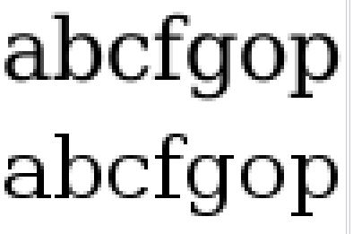
Unhinted text (top) and hinted (bottom)
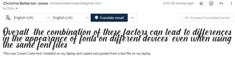
Font Availability: Not all devices have access to the same system fonts and additional fonts may be installed separately. If a font is not available, it may be substituted with a similar font, leading to a mess! e.g. Chris installed the “Cream Cake ” font on her laptop and copied and pasted text using this font from a document file into an e-mail – then sent it off. Here’s what it looked like in the e-mail when viewed on her laptop:
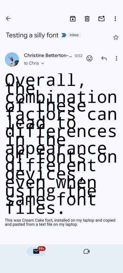
And here’s what it looked like on her Android phone. This is the same e-mail…
Operating System Differences: Different operating systems may have different font rendering techniques and default settings, which can result in variations in how fonts are displayed.
You can install additional fonts in Windows very easily from font libraries such as Dafont They are often free for personal use, but if you want to use them commercially – e.g. in publishing a book, then you have to pay!. Peter described the nightmare he had, both technical and legal, in managing fonts for a self published book in Digital and Print form.
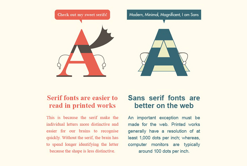
What’s Serif and Sans Serif
What’s Font Pairing?
See: “The Ultimate Guide to Font Pairing” https://www.befunky.com/learn/font-pairing/
How can I share a document which has a fancy font in it?
Save it / export it as a PDF (Portable Document Format) – the font will either be embedded or the text saved as a bitmap (image) of the text.
Christine Betterton-Jones – Knowledge junkie